Intro
KDE Connect for Android is a crucial part of the KDE Connect experience, and overdue a facelift.
In this short blog post, I’d like to walk you through three main design ideas, why they’re necessary, and how they’ll make using the app easier for both new and experienced users.
It’s worth noting that none of the designs you’ll see exist yet. The fonts, the shapes, the colors, and everything visual are all subject to change based on user feedback. If you don’t like the look of something, please share your opinion so that we may iterate on the design.
Ideas
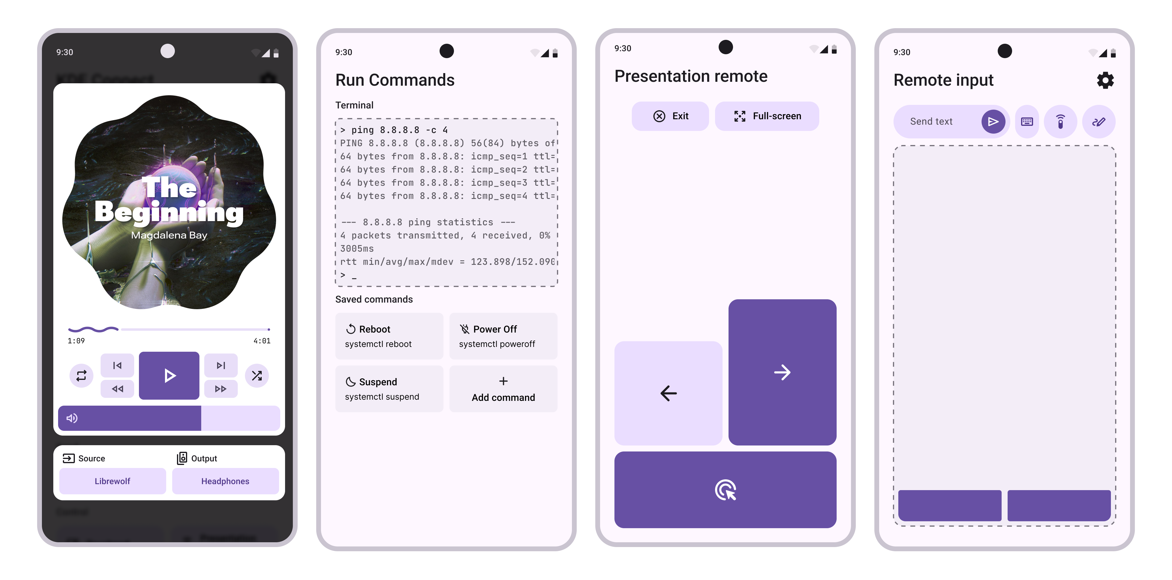
Idea 1: Main Menu
Now, it may seem a bit weird, but currently, KDE Connect doesn’t really have a main menu. What does exist is a combination of a device manager and a sidebar, both of which have their uses, yet are also very similar.
That’s not ideal because the home screen is such a prevalent design motif that all users subconsciously have an idea of what it should be, what it should look like, and what it should allow them to do.
When the functionality is split between two parts of the app, it gets unnecessarily complicated.
So, let’s merge them!
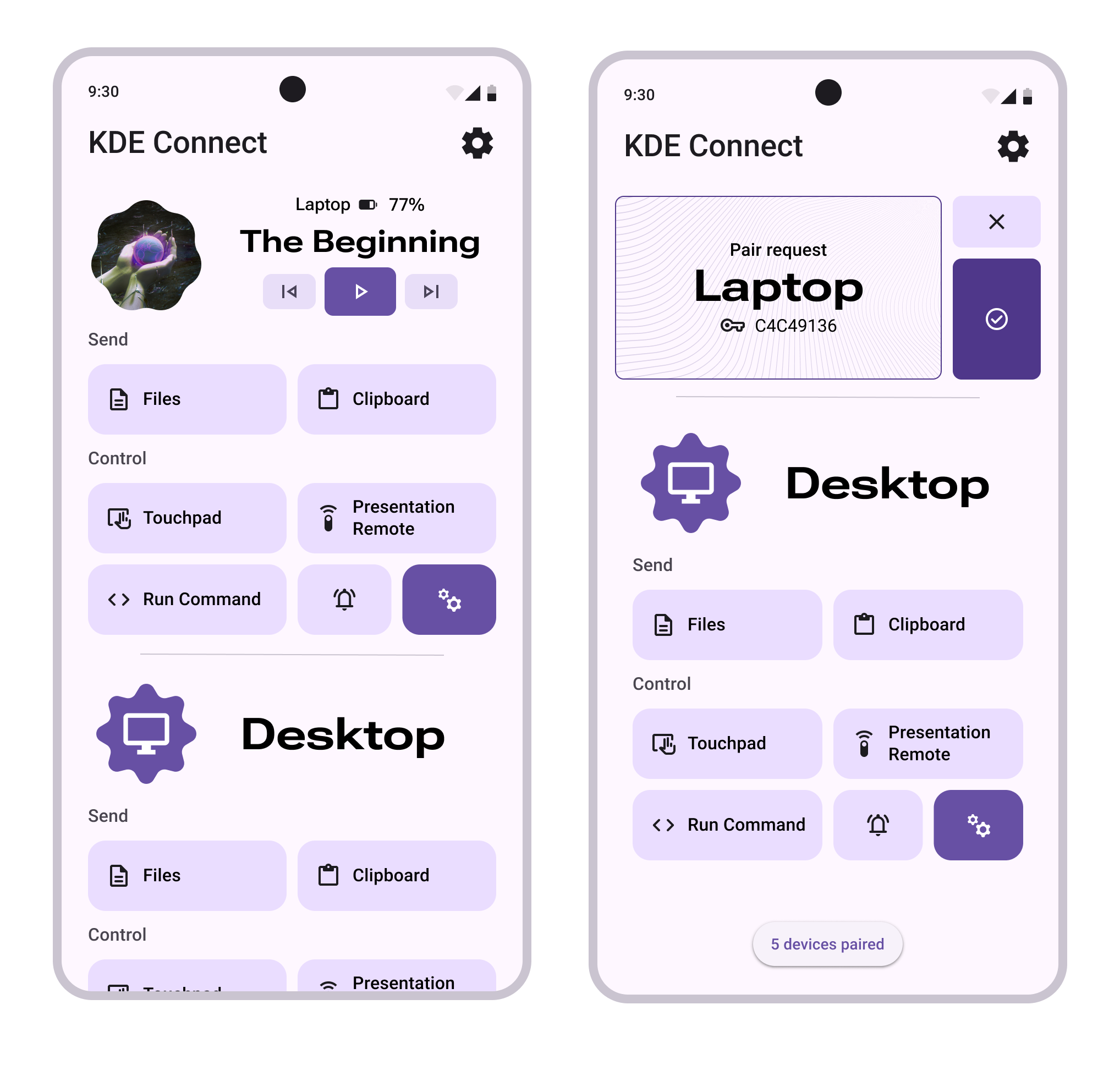
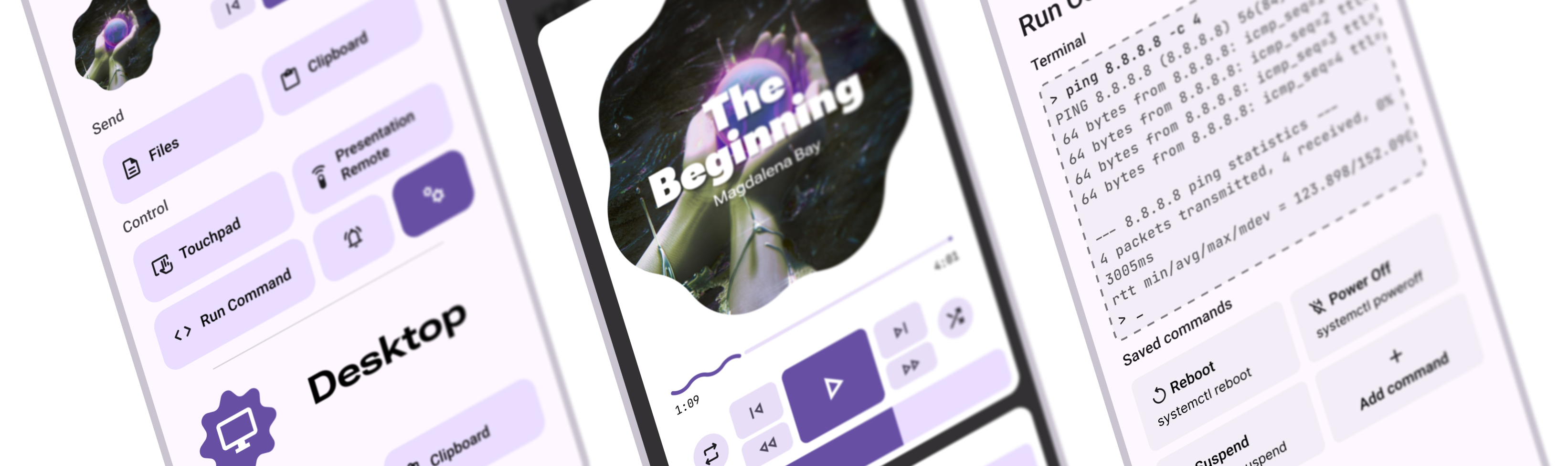
The new main menu lets you access all your devices instantly, with all the features you want right at your fingertips.
Certain functions, like the media player, have been made even easier to access by pulling all the most-used controls out of their menus.
This is also the screen where you’ll be able to manage your existing devices and discover new ones without the need to navigate through numerous submenus and notifications.
The most important thing, though, is that now there is a screen that the user can call home. This gives the app structure and makes it easier to think about what you want to do and to remember how to do it.
Idea 2: Sensible Settings
If you’ve ever had to look at the device settings, you already know what the problem is. If you haven’t, here it is:
The Problem
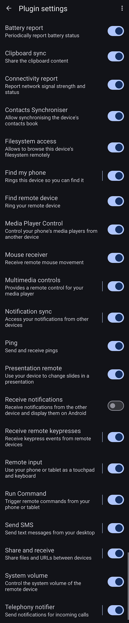
It’s the closest thing to an impenetrable wall in UX design. It’s comically long, has essays’ worth of text, and has tons of barely visible submenus.
Not only that, but it actively misleads you, as some of the settings are secretly global and apply to all devices, despite being accessible only from a specific device’s menu!
So, what’s the solution?
Burn it. Burn it all.
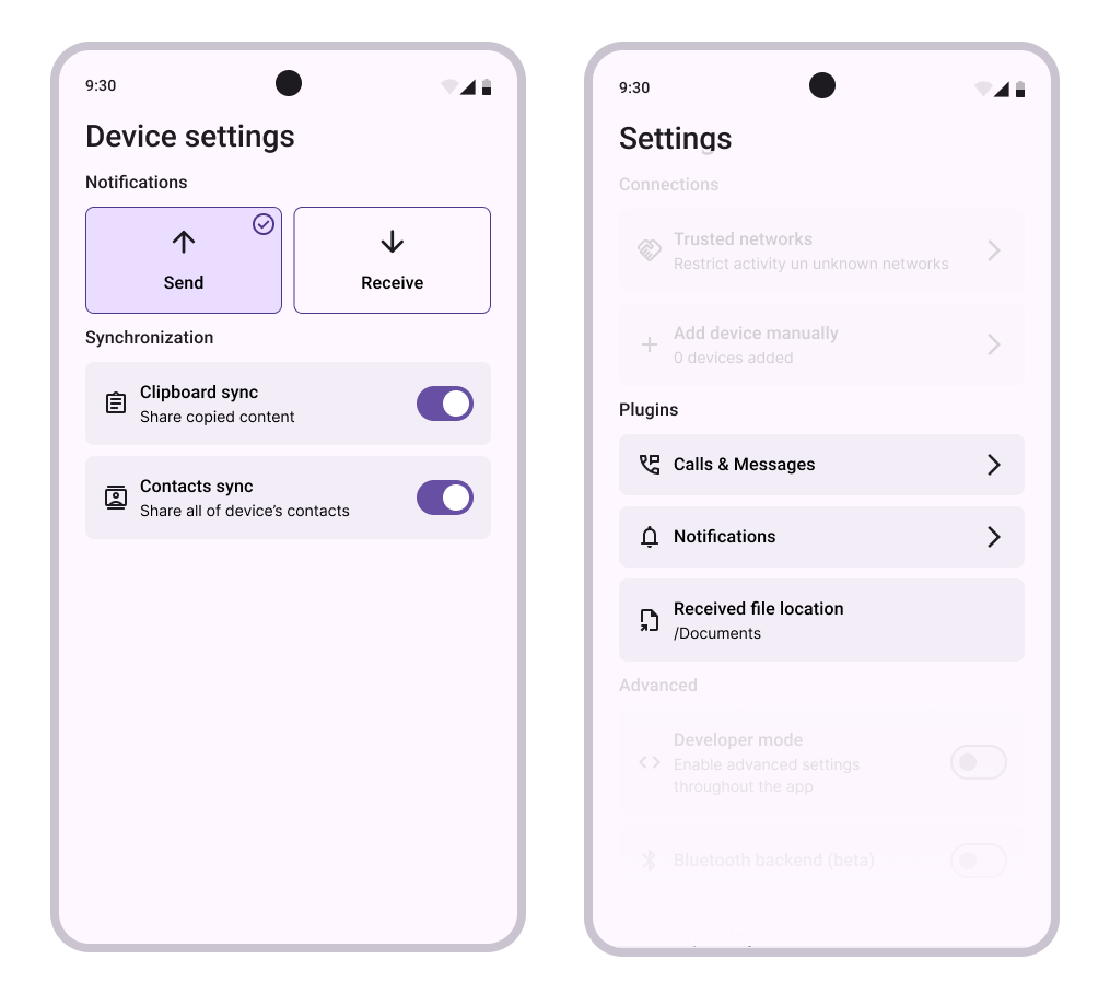
By moving the global settings to… the global settings and by removing all the buttons that toggle the visibility of other buttons, it’s possible to trim the menu down to the point where it almost feels like it’s too small.
This allows for a kind of categorization where the more “advanced” features are indirectly buried while the most common switches are brought into the center of focus. That’s a great way to create a nice learning curve where only the users looking for the settings will find them while keeping the UI very clean.
Idea 3: Respectful Permissions
The Problem
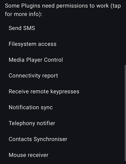
Requesting all the permissions at once, while very practical in the programming sense, is a major red flag for any new user.
First, it suffers from the same mistake as the current device settings menu — sheer text overload. It makes the app feel overbearing. Asking for an entire screen’s worth of permissions also makes the user feel intimidated because a lot of them grant the app access to sensitive data. Even when the app is open source, maintaining user trust is important.
Second, it’s a poor security practice. You don’t ever want to ask for permissions you may not use.
Third, it’s annoying. Android constantly nags users about whether they’re sure they want to continue granting accessibility permission to apps, and it gets old very quickly.
Instead, the app should ask for permissions on the fly: the user wants to enable contact synchronization? Ok, but first we need your permission for that.
Other stuff
Of course, the app is very big and there are a lot of places for improvement. From the utilitarian, like improving accessibility, to slightly philosophical like guiding the user’s glance onto the most important parts of the screen.
All things considered though, there are plenty of decent screens in the app already. In such cases, all that’s left is a tiny makeover to match the current digital trends or to improve readability slightly.
End
Finally, it’s worth mentioning the biggest obstacle to improving the UX of any open-source project — time (or lack thereof). Everyone is working out of passion and in their own free time.
While such a system has brought loads of awesome projects to life, the decentralized nature also makes it very difficult to organize and implement holistic changes that do little on their own yet make a tremendous difference when combined.
If you have the time and the will to help realize the mockups, your contributions will be appreciated.
This is also a good chance to modernize the tech stack by moving away from XML layouts to Compose UI. All of the proposed changes can easily be implemented incrementally without reworking the app from the ground up.
The meta-issue regarding this can be found at https://invent.kde.org/network/kdeconnect-meta/-/issues/29.