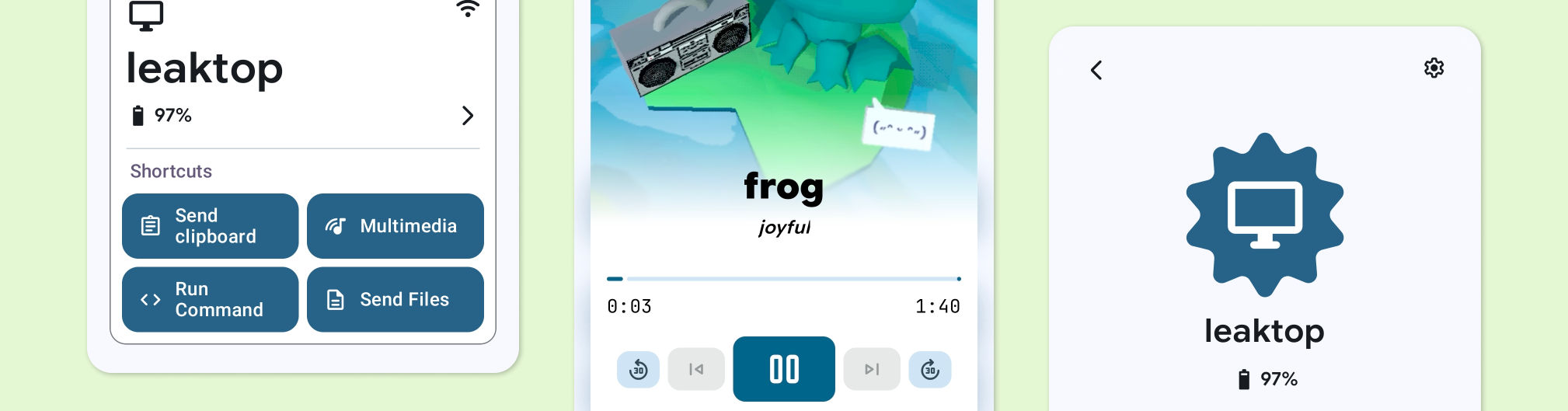
Intro
Hey, if you just wanna get your hands on it, here’s the link to the repo:
https://github.com/leekleak/kdeconnect-android
and here’s one for the latest release:
https://github.com/leekleak/kdeconnect-android/releases
Any and all testing is appreciated. I should note though, that along with the redesign I also may have rewritten half the architecture to better fit the UI, and with such a big undertaking regressions are expected.
Still, I hope you have fun :)
On the other hand, if you’re more interested in hearing what changes were made and why, the rest of the post is for you! I’d like to walk through some of the changes made and why they were necessary.
I was thinking of maybe doing a timeline of the original design, the first draft of the design that was shared half a year ago and then what I finally settled on, but I think I’d end up being way too mean to past me, so let’s just look at what’s new.
What’s new
Everything!! But first,
The Main Menu
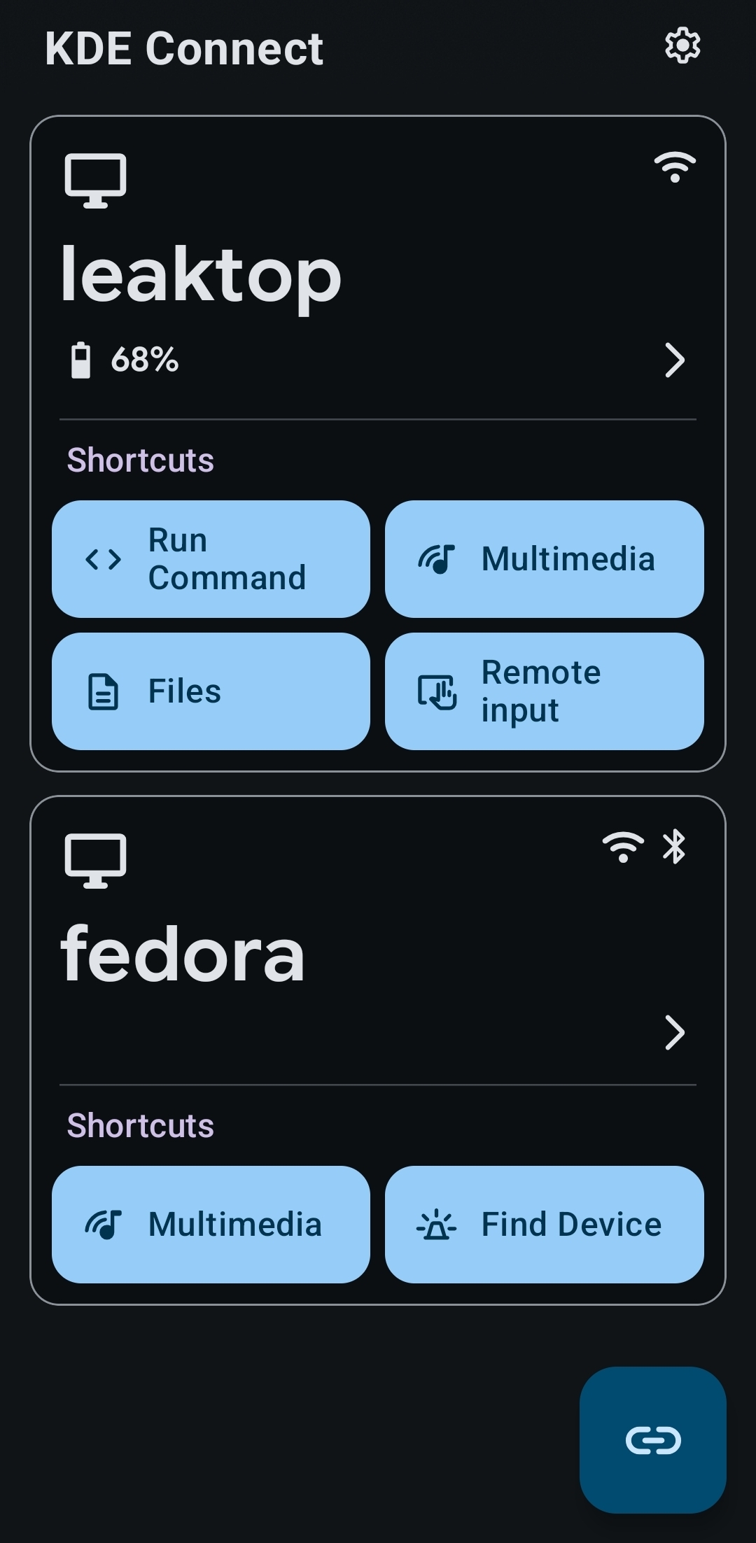
Well, here it is!
The most obvious change is the cards, or more specifically – shortcuts. That’s actually the only real new feature within this redesign. The usability wins I think are pretty obvious as users typically only use a couple plugins, so the ability to pull them out into the home screen is rather handy.
As well as that, the cards expose a bunch of extra info such as the types of connections used (Wi-Fi/Bluetooth) and battery level of the device.
But that’s only the surface!
As the cards now take up much more space, unpaired and unreachable devices had to be moved away. I think that that’s just a good result in general as that reduces the info load for a new user and while that adds 2 new entire screens to the app, don’t worry, many more have been removed.
Pairing new devices can be done by pressing the button at the bottom right (it flashes with a badge if there’s any available devices) and paired devices have a separate menu in the settings.
Next change, which is hardly visible, but incredibly consequential is the removal of the side bar. Previously it acted as the main menu, but that’s a rather unusual design, and the new home menu should feel much more familiar.
Pairing Overlay
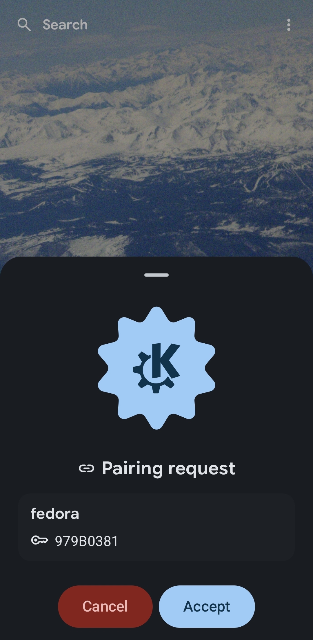
Finally, in the second screenshot you see a brand new overlay used for pairing. You no longer have to fiddle with sneaky notifications and can pair new devices even when outside of KDE Connect.
Device
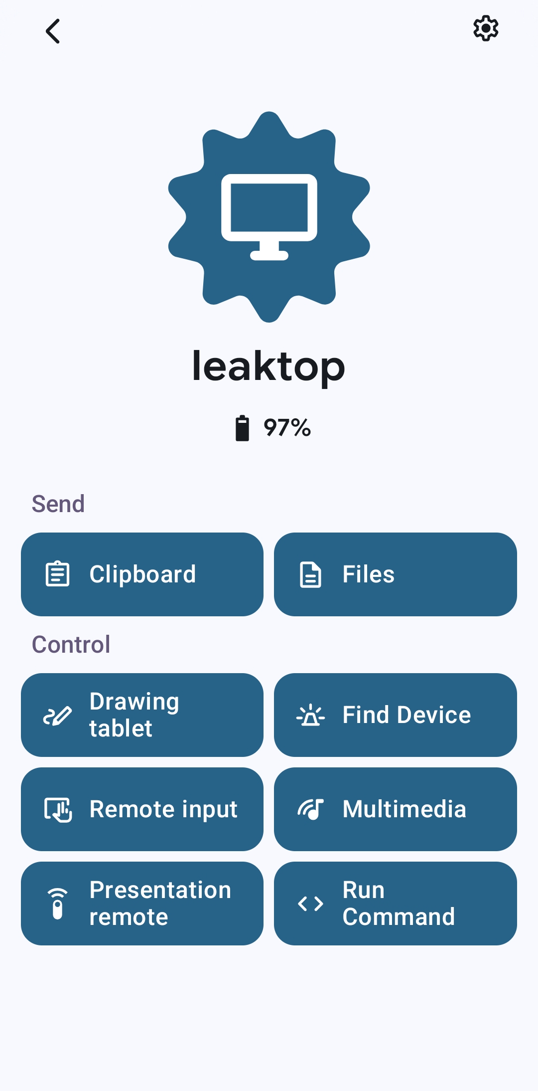
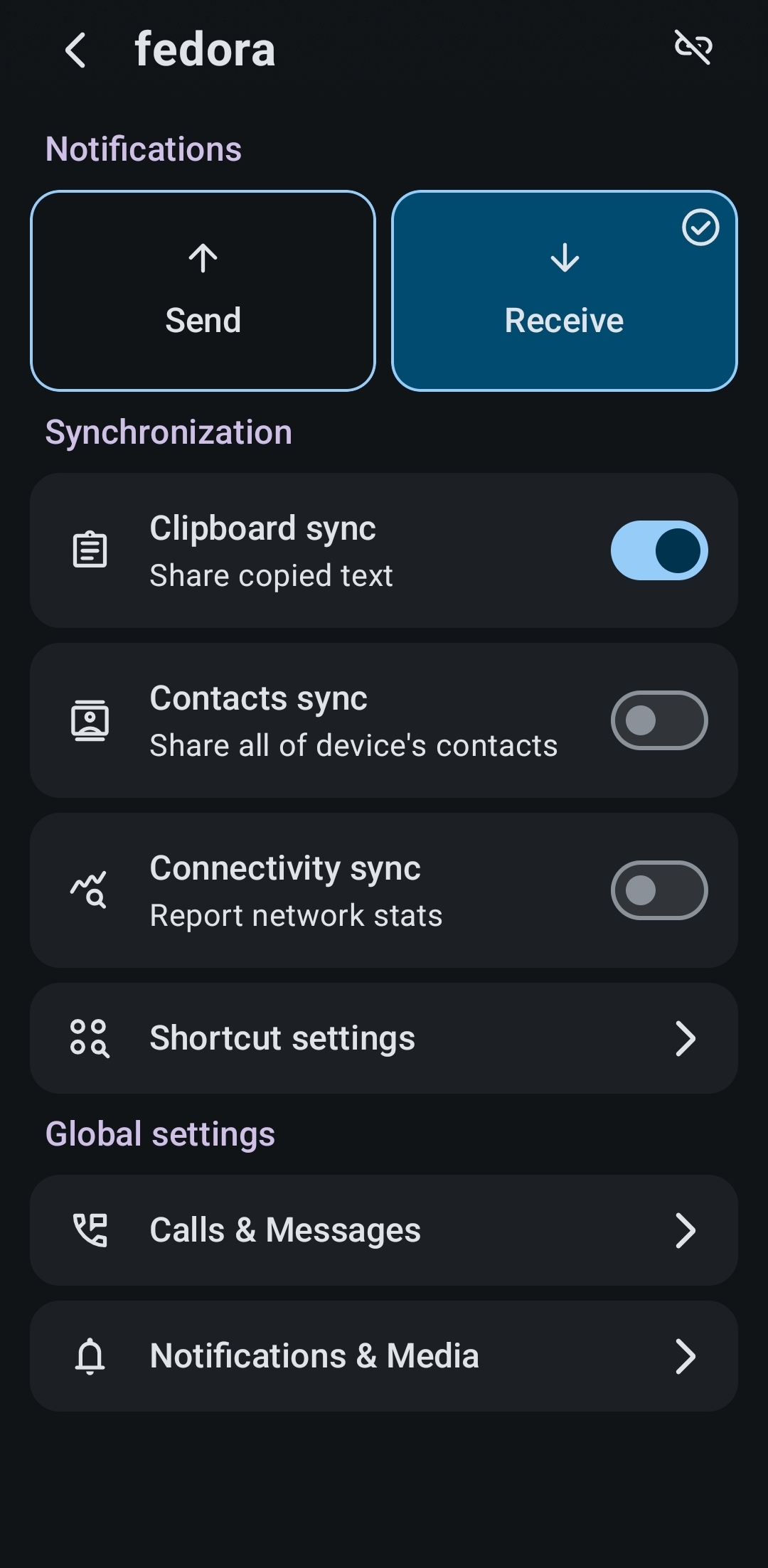
Control centre
Here, we have a mix of changes. From small ones, such as categorising the buttons and pulling them closer to the bottom of the screen to some massive ones.
The first one is the brand new permission system.
Before you’d get a massive list of plugins that don’t work asking for some really aggressive permissions. Quite a scary screen for a new user and just confusing for anyone experienced.
So now it’s much more sane! You get a permission request whenever you use a feature that needs it! The permission request looks just like the pairing overlay and can also display over other apps so if a feature you want to use is not working due to a missing permission you’ll be notified promptly.
Note that currently it seems like GSConnect really wants filesystem permissions lol.
Device Settings
I dare you to go look at the current device settings menu. Needless to say, I’m pretty sure anything would have been an improvement. Generally settings are quite boring (to talk about! So many changes though.), but one important thing to note is that previously it wasn’t really clear what settings were global and what were per-device.
Now all global settings have been moved to the app settings menu, with only a clearly defined “Global settings” category providing shortcuts to them.
Plugins #1
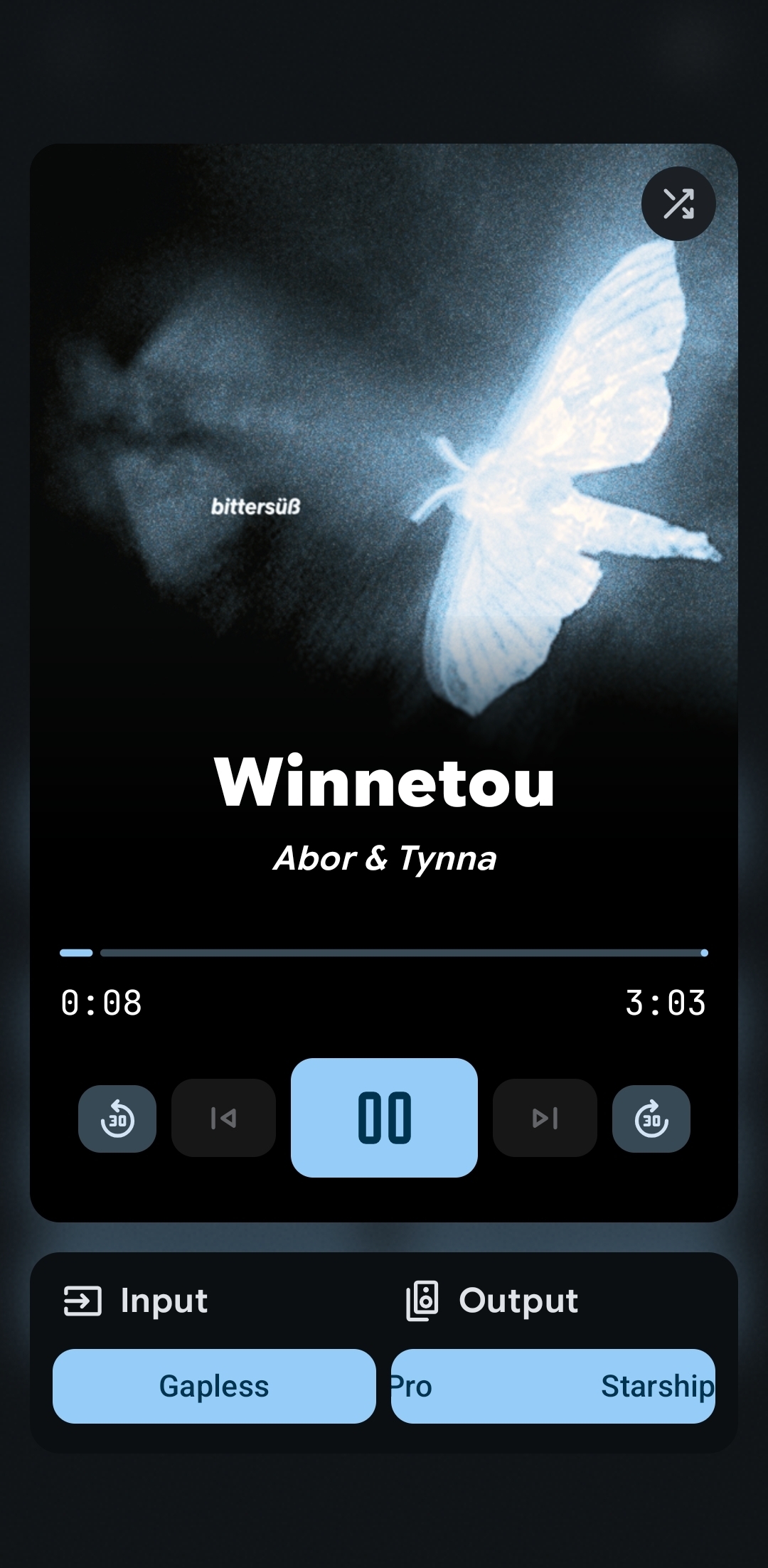
Music Control
The story with all the plugins screens is going to be mostly the same: Simplify and consolidate where possible. Clarify otherwise.
Let’s explore the first part in the music control screen. Used to have 2 tabs. One had the player, controls, inputs, volume control. The other had outputs and volume control (again).
Instead everything has been consolidated into a single screen with clear separation of concerns. You have all media controls in the big floating island.
Inputs/Outputs are separate yet still within view. Clicking either opens their respective pop-up window where you can select between available choices and control their volumes. Both use the same UI skeleton, because why shouldn’t they :D
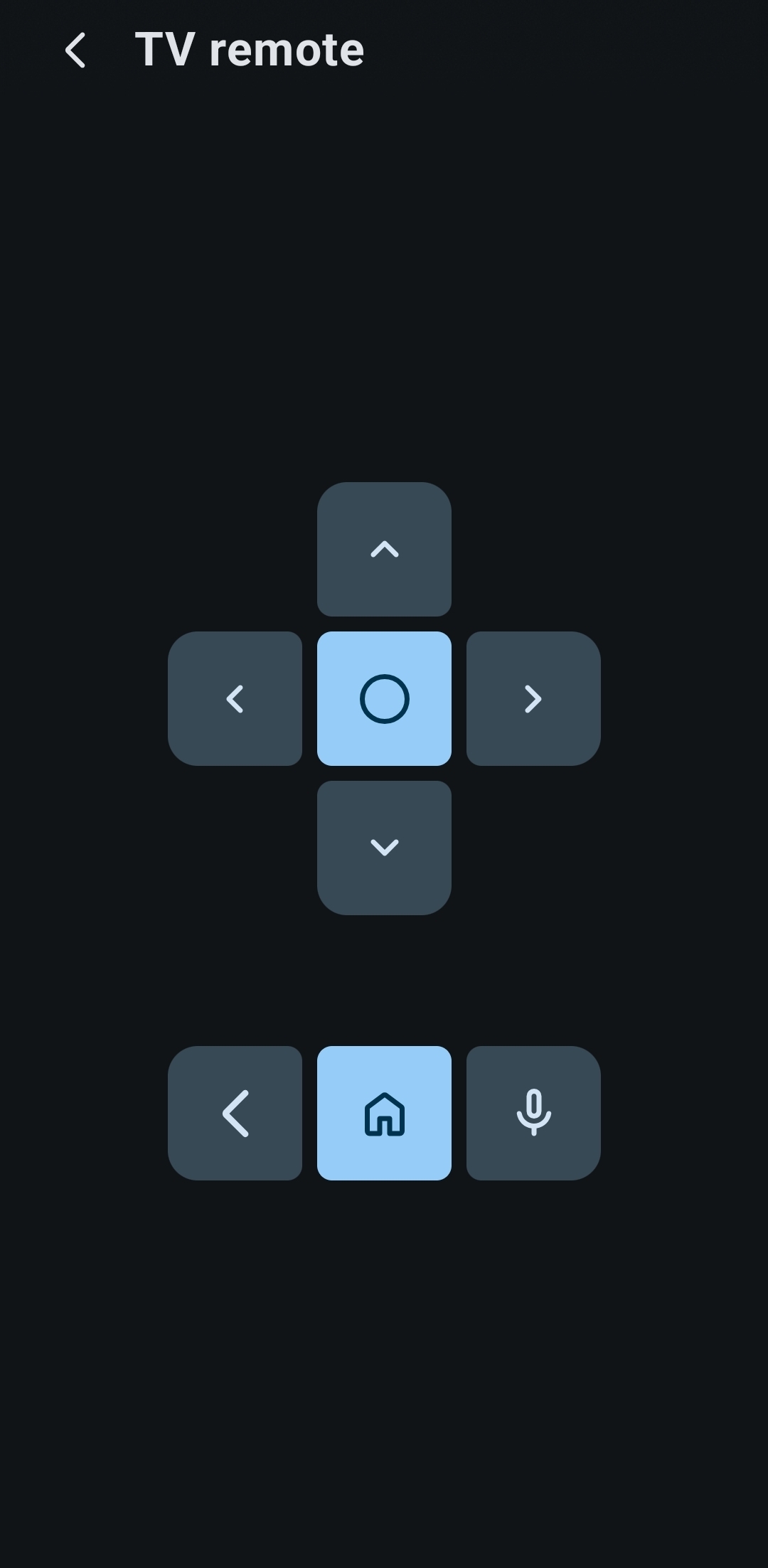
Remote
Here is an example of the second point (Clarification).
Nothing to add or remove to a remote, but we can make it more familiar by mimicking the layout of actual TV remotes. Skeuomorphism is so back baby! Add some color to important buttons and you’re golden.
Plugins #2
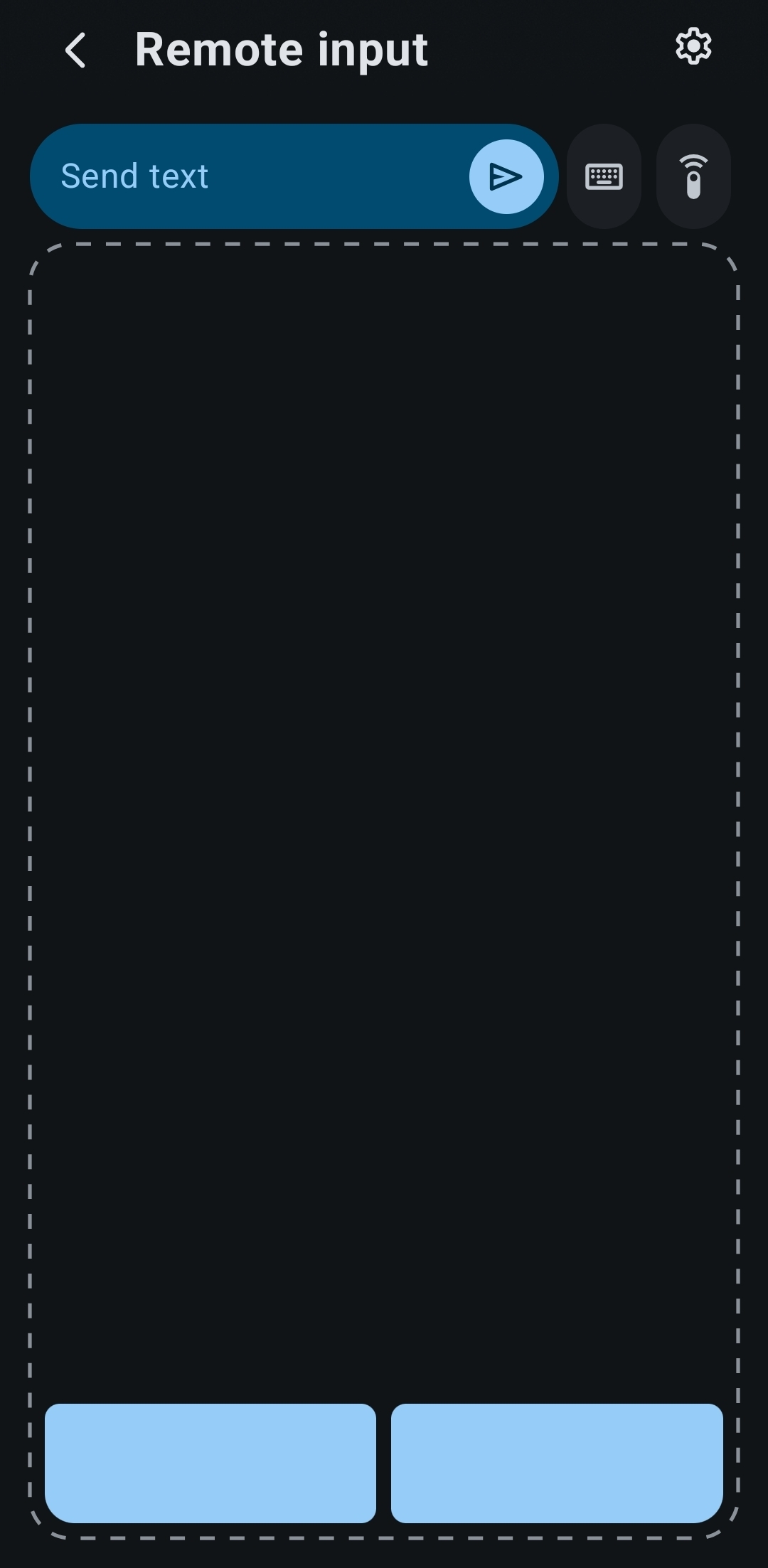
I didn’t plan this out lol, but just like with the first two plugins the first is an exercise in consolidation and the second in clarification.
Remote Input
Again, we use the magic of skeumorphism to make the touchpad actually look like a touchpad, which automatically tells the user how it should work.
As well as that, the “Send text” feature has been merged into this screen so you never need to leave the touchpad.
The touchpad now even automatically resizes to avoid your keyboard, so you can have both be open and usable at the same time. Handig!
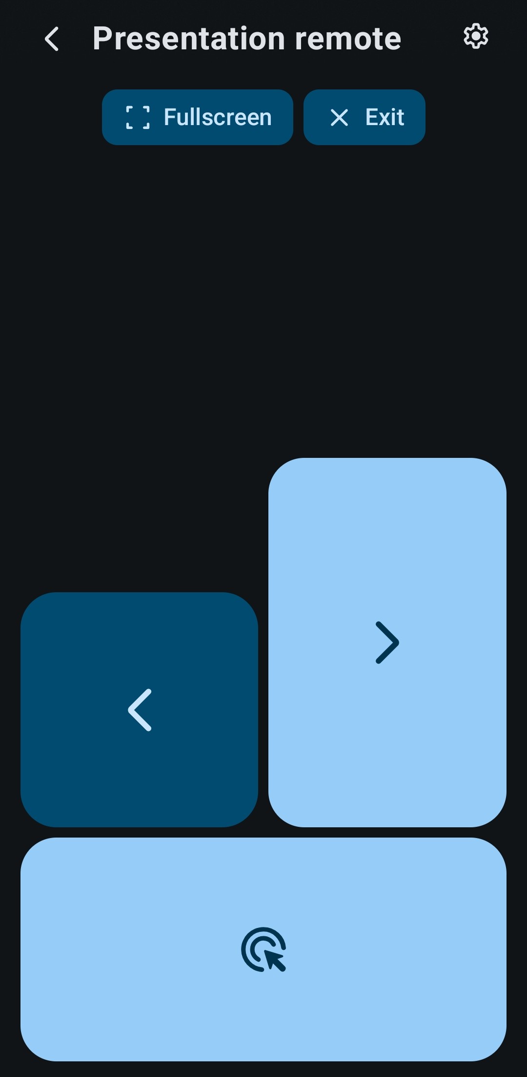
Presentation Remote
Now for the exercise in clarification. Few changes otherwise, but important buttons are bigger and brighter.
Other
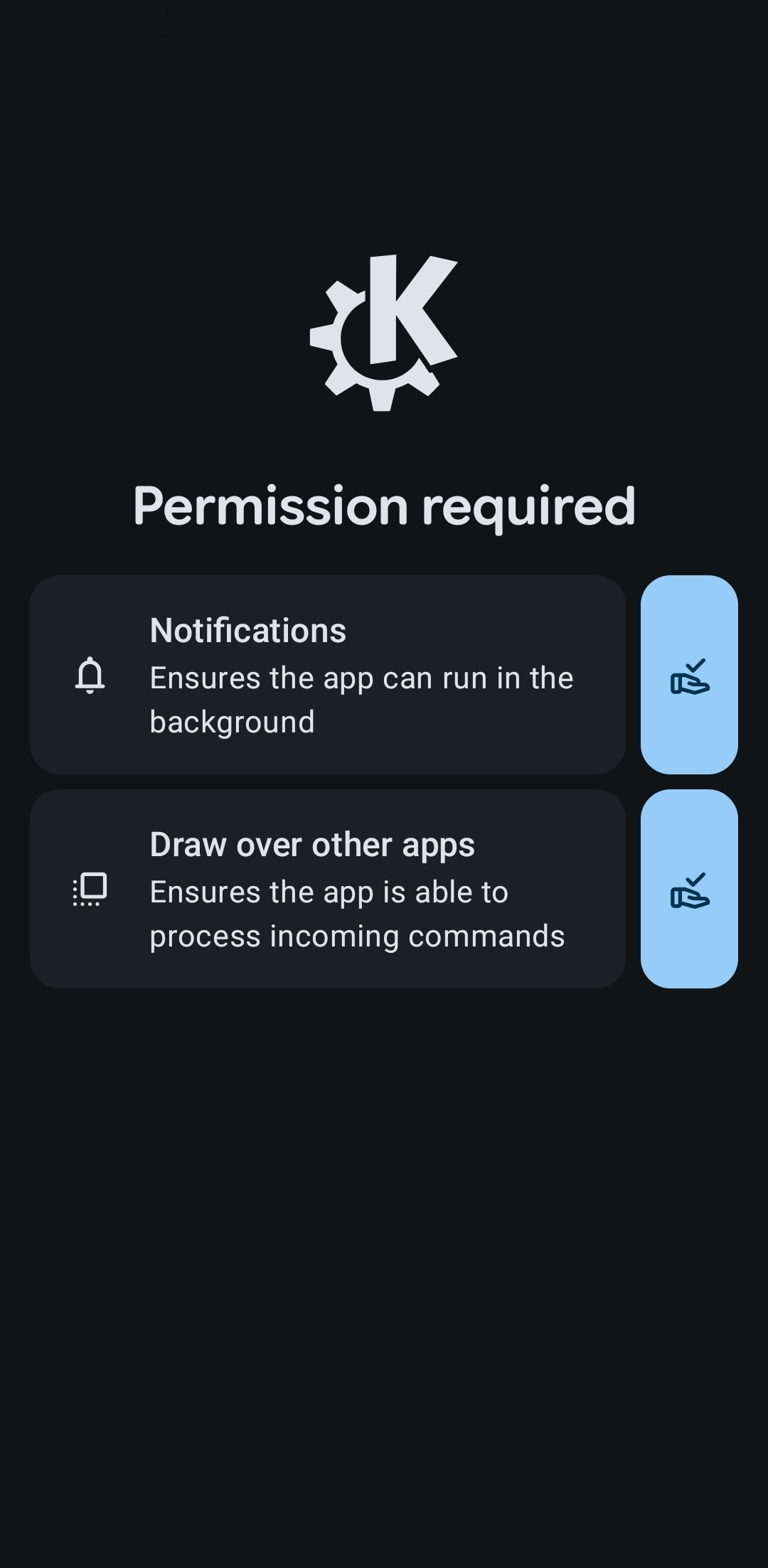
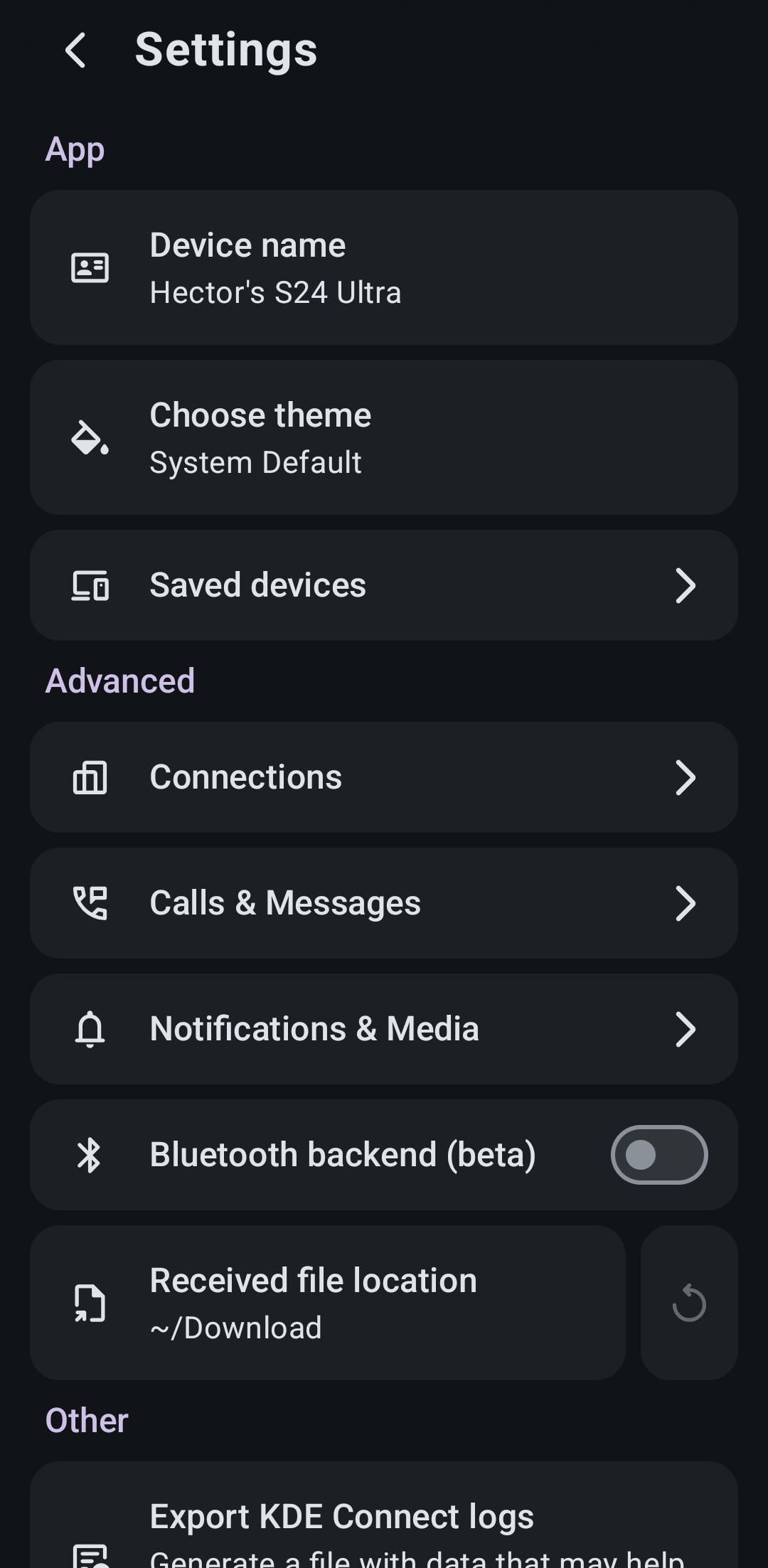
Of course, some screens are not as exciting, but they’re important nevertheless.
With Android 17 the amount of permissions the app needs to function has grown, so a separate screen makes sense. (On 17 this screen should have 3 permissions, but my phone is not yet updated.)
App settings are there for app settings. Crazy.
Final notes.
That’s not all though. There’s a plethora of changes that, if put to words, would fill an entire book, so go install the app and find them out yourself :D
In all seriousness though, this has been almost 2 months of work on my part, even with some help from LLMs with the boring refactorings. I’ve learned quite a lot and now I get nauseous even thinking about the quality of the codebase of my previous app (Traffic Light! Shameless plug but go check it out too!).
Of course, please open issues especially for any regressions that are present in the redesign but not the original. I’ve been working on fixing up the pairing logic for over a week and I still think there’s probably some edge cases I’ve missed lol. If you’re a designer and think I’ve made some design no-no’s also feel free to reach out, though I’m not sure how much free time I’ll have with the start of the new uni year.