
After all that effort I feel like I owe myself a little retrospective just to marvel at how far the project has come. So let’s go through the last 3 months of my life one version at a time.
Wait no, that makes it sound like I worked on it way too much :Dd I’ve actually been spending most of my time watching movies, studying and trying to 100% AC Valhalla (I’m not sorry for having trash taste).
Either way, let’s get started.
My last blog post about this project was uploaded on November 18, 2025 with the latest version being v2.2, so let’s start from there
Version 2.3
This version had a single focus - get the battery consumption as low as possible. Before then I hadn’t really used the app myself for an extended period of time. During development I’d be constantly reinstalling it several times a day which would reset all the data, including how much battery the app was using.
After releasing v2.2 though, I decided to take a bit of a rest which led me to discover that the battery consumption of the app was a bit crazy. That caused me to panic a bit so I spent a week trying to find ways of measuring and reducing battery consumption.
While trying to achieve that efficiency I also found out that there are no easy ways to just straight up measure the battery usage of a service so I conjured up a crazy pipeline of manually dumping logs and running them through a user maintained fork of an 8 year old Google tool called Battery Historian. Shout out to @itachi1706 for maintaining up until now and to @5731la for hosting an instance so I don’t have to host one myself.
While in the release notes I advertised the new version as being almost 8x more efficient than Internet Speed Meter, compared to v2.2 it was almost a 40x improvement.
Version 2.4
Oooh boy, what an embarrasing release.
While the changes themselves were good and all, unfortunately after releasing this I decided to do a bit of marketing on Reddit.
The good news? It blew up. On r/fossdroid it quickly became the most upvoted post of the month and one of the most upvoted application releases of all time.
The bad news? Well, the userbase up until then was rather small, just people who saw the icon on F-Droid and decided to check it out.
Little did I know, the app would crash for literally all Indian and Nepalese users. Yeah. Quite the big deal. I was quite surprised no one had bothered to report it up until then but on the Reddit post I got a bunch of comments complaining that the app failed to launch.
The issue was that I had neglected the existence of funky timezones with minute offsets causing my database to simply crash.
Unfortunately to fix it I had to pretty much ditch the database entirely and rely on solely the system APIs for data. That was fine, but the pressure of having this huge huge problem just as the first big wave of new users hit was quite frustrating.
Version 2.5
Luckily I did manage to get the fix out in just a couple of days and that’s pretty much the only thing notable in this release.
I did add more animations for fun, however all of them were added to the history menu which has since been overhauled so none of it really matters anymore.
Version 2.6
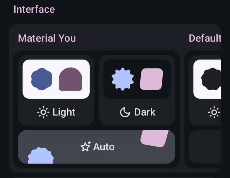
Now v2.6 was very much a visuals focused update. I finally set up Weblate support which spun up quite a few translations into foreign languages, which was fun.
Probably the biggest addition was this theme picker, which I think speaks for itself:
I also added a splash screen animation just for the love of the game.
Finally, I created an option to use system fonts because on the Reddit thread that was literally the complaint #1. To be entirely fair, I get it. While making that part of the app I thought it looked incredibly cool, however with time my opinion of it has soured and I plan to remove it some time in the future.
Version 2.7
This was a very architectural release that didn’t change much for most people but it did help pave the groundwork for further development.
For context, until then the app forced the user to grant all permissions upfront in a pretty scary screen with a lot of text.
This was a bit of a problem because I noticed there were exactly 2 entirely different types of users. The first one was the audience I was thinking of most during development until then - the people who were looking for an open source alternative for Internet Speed Meter and more specifically the status bar network speed tracker.
However from the types of comments the app received and the types of feature requests that were being opened I noticed a growing amount of people that were more so using it to track the historical network usage.
And thing is, both usecases require entirely different permissions. For the status bar icon you only needed the notification permission while for historical data you needed the much more protected usage permission.
It made no sense to ask for everything upfront and this release fixed that.
This release also added a very shitty and slow menu to track app usage which I just pushed out as a proof of concept.
– 2026 –
Why would I add a section for the new year? Well… Something quite big happened exactly on January 1st.
I noticed a concerning amount of traffic. Admittedly it wasn’t that crazy, roughly a similar amount to the time I advertised the app on Reddit, however the difference was that I had no idea what was causing this.
Well I figured it out the next day:
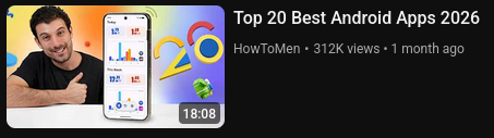
Yeah, the app was on a thumbnail of a video with… Checks notes… 300k views.
Again, just like with the Reddit post, I was happy with the attention but also quite frustrated that the app was showcased in that state as I already had drafted plans to pretty much overhaul the entire UI.
And the plans would start being implemented quite soon:
Version 2.8
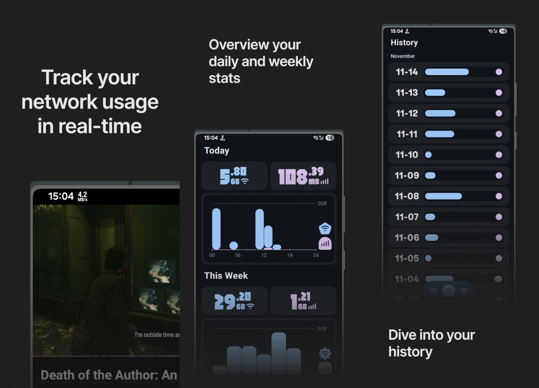
This release was probably the biggest one up until then. I spent around a week just thinking about how to best redesign the history page and another actually implementing the change.
The thing is, Google really doesn’t provide any graph libraries and no one else has made a good one either. That meant that to achieve the graph I’d envisioned along with all of its different modes of interaction (scrolling vs flinging), all its animation and adaptive elements such as the month headers I had to draw it all manually.
That meant calculating each pixel of each box, each line and each piece of text. I spent way too much time on that graph. Both thinking about it and implementing it.
Though it’s also important to say that I’m really proud of it too. That’s not to say that it’s perfect, I still have some things I want to add to it, but it’s much easier and simpler to use than my original inspiration - GlassWire. Whereas in GlassWire you have 2 modes (view and select), 3 scales (day, week, month) and very poor spacing and visibility, in Traffic Light you have great contrast and an elegant way of interaction - the simple drag.
The app list is great too. It’s much more dense than all the others I’ve seen, while being more readable and showing more useful data.
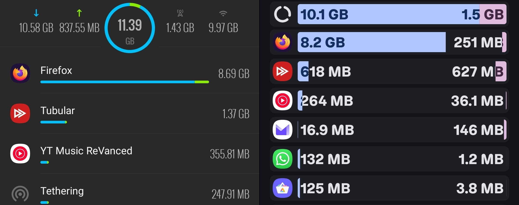
Again, just like with the graph, there’s still a bunch of ideas I have to improve it, but for now it’ll have to do.
Finally, this release also fixed quite the devious bug where the status bar notification would show inflated speeds when a VPN is connected. Internet Speed Meter doesn’t do this and I feel like this was really the point at which Traffic Light became just an objectively better app.
Version 2.9
Another huuuge release. This one was very much an experiment, but one that paid off handsomely.
For one, the project was re-licensed under GPLv3, which is fun.
However the much bigger news was the introduction of data plan tracking with the help of Shizuku. Also, as far as I know, this made Traffic Light the only app in the world to support the tracking of multiple SIM cards, which is a nice selling point.
Honestly working with Shizuku was both harder and easier than expected.
On one hand I spent several days trying to figure out how to get transaction codes procedurally, gave up, loaded up all Android emulators from Android 10 through Android 16, grabbed their transaction codes and hardcoded them via a version check.
On the other hand, after a week of rest I came back and implemented the whole thing procedurally in like an hour with a Shizuku User Service.
Also, reflection sucks soooo hard man… I genuinely still struggle to believe that half the code I wrote works.
Version 2.10
After popular demand I finally decided it was time to implement widgets. Oooh boy do I have a few words about them
The Rant
MY GOD. WHAT THE ACTUAL FUCK.
Ok, so one thing you have to understand is that you can’t just write widgets as you would a regular piece of UI. They have their own special API called RemoteViews which sucks. Like genuinely awful. I used a modern wrapper called Glance, which is supposed to make stuff easier. And idk, maybe it did. I only shudder to imagine how bad it would have been otherwise.
The good thing is, it feels familiar because it uses the same syntax as Compose. However that’s also its biggest problem. Because the API is very limited you’re constantly hit with issues you would know how to solve in Compose UI yet here you’re totally stuck because some engineers in Google said so 10 years ago.
Also it’s so annoying because Android studio now randomly automatically imports Glance imports into regular Compose UI files which break everything and I have to manually go and fix it.
And also also Glance constantly shoots itself in the foot and you, as the developer have to go and work around it. Like let’s say I want my widget to be configurable. Well Glance forces the widget to render before it is configured. That would be fine, because you should be able to just update the widget again after configuration EXCEPT Glance has a rate limit for updates where your update requests are ignored if they are called more than ~30s after the last one.
So I then have to intercept the Glance update logic to explicitly forbid it from updating before the widget has been configured.
Oh god, and then the regular update cycle. My god… I tried using the modern Google recommended method of using WorkManager except it also sucks and can only update once every 15s and I want to end the pain. And then once I did figure out how to update it semi reliably I had to create a mechanism for the updater to skip updates because otherwise the battery just fucking dies and oh god…
New icon :Dd
Yipeee. The old icon was ok as a png, but a bit dark and dull. Since most svg implementations don’t support most of the features that made the icon look fine as a png, I decided to tweak it so it looks good everywhere. The colors are brighter, the background is less sharp and the colors have subtle gradients that make them look a bit neumorphic which is nice as that’s the aesthetic currently en vogue.
I do think it looks a bit AI generated, but no one has complained about that yet and I do have the Figma project to prove I made it so…
Also, remember the toggle I added to disable expressive fonts in v2.6? Well it started causing problems for the more bespoke layouts added in recent versions so I decided to slowly start deprecating it. Now it only changes the font of the blocky numbers in the overview as that’s really the only polarising part of the app.
Hopefully when I redesign the overview, I’ll be able to to remove the toggle entirely.
That’s it folks!
Well I mean that’s it for this short little retrospective I wrote for myself. I still expect to work on the app for quite a while and there’s a bunch of adventures to be had.
I suspect I’ll feel compelled to write a blog post about my journey to Google Play store if I ever get there.
I’m really happy though that for once a project of mine is actually used by people and seeing the community grow has been very encouraging. My open source endeavors are only beginning and it won’t be long before I’m back with more. Stuff is cooking - that’s all I’ll say.